

A version of this post originally appeared in the August 20, 2020 issue with the email subject line "How to read Google's first-ever content analytics dashboard."
I’ve written many times before about my complicated relationship with Google, so no need for that today. Yes, of course they are too big, their mindshare is far too unquestioned, their grip on the short-and-curlies of the business intelligence world is heinously firm, but we still have to live with their rules, and comprehending their measurement approach means understanding a massive part of the digital supply chain.
And learning new software is fun for some of us because we are dweebs. Right now I’ll take the dweebjoy where I can get it.
A brief overview of Google Search Console for the uninitiated
Fka Google Webmaster Tools, Google Search Console is a diagnostic tool for understanding how your website appears in search results. It’s not tracked on your end, so it’s not cookie-based; Search Console is Google giving you its data about how your website is featured in its organic search product.
Search Console (abbreviated to GSC) is how organic search marketers communicate with Google, but most of its features are technical: is your website showing up in search at all? Do you have broken links? Is Google mad at you?*
![Peggy Olsen angrily tells Don Draper, "You know what? You are not mad at me! So shut up!" [gif]](https://cdn.substack.com/image/fetch/w_1456,c_limit,f_auto,q_auto:good,fl_progressive:steep/https%3A%2F%2Fbucketeer-e05bbc84-baa3-437e-9518-adb32be77984.s3.amazonaws.com%2Fpublic%2Fimages%2F3b23d528-70f1-4cbc-81e1-cd8c3d747b2d_500x275.gif)
In the past few years, Search Console’s features have evolved to be more content-focused. The tool’s query report has always provided a sample of the search queries for which your website appears. This report lets you know when you’re ranking number one for keywords like “Netflix KPI” (heck yea suckas how’s that for some content-driven SEO yes I just found this out!)*
Especially when combined with Google Analytics (GA) data, GSC provides a powerful view of how your audiences are reaching your website from search and what content they are reading and using and all that.
Like most Google tools, both GSC and GA require some training to use. They can each showcase a ton of actionable data, but unless you understand how the charts relate to your content, the tools can be extremely hard to read. Google’s video trainings are good, much better than they were 5 years ago, and I’d recommend them if you work with websites. But they can be a little too eCommerce-focused and, from my memory, not useful for explaining how to read or interpret your data beyond the money metrics. Organic content, not nearly as easy to value as the advertising beside it, is mostly left in the mire, and publishers just keep looking at traffic because measuring content impact is difficult.
But finally, as it does, Google has taken a cue from the other content analytics tools on the market and developed an insights tool to consolidate and simplify its content analytics features for publishers.
*240 global searches/month, no, that’s not that many; 36% CTR on all variations, yes, that’s very good, thank you for asking.
Introducing Google Search Console Insights for content measurement
Google is slowly rolling out its beta “for content creators,” which I received for only one of the many GSC accounts I manage. Special thanks to my client, who is kindly letting me use screenshots data from their GSC Insights dashboard.
GSC Insights is an automated dashboard with content-focused data from both GSC and GA, along with some brand new data that Google has never before offered as a default calculation. For this feature to work, your Google Analytics must be connected to your Google Search Console. So! Let’s dive into what it measures and what it all means.

The dashboard starts out with a giant meaningless scorecard metric with zero context, so you can pat yourself on the back while you gaze lovingly at the big number.

ICYMI, here’s my beef with single KPIs and my other beef with pageviews. I have no use for this top module, and I hope that publishing executives never glom onto this metric as the one. But they will because the design of this dashboard makes it look important, even though only looking at all-time pageviews goes against every bit of measurement theory Google has ever taught.
But it gets better! Next on the dashboard the How your site is doing section. (Again, I might pick a more specific label for the section, and I’m totally going to leave that feedback!) In the meantime, how are you doing, site?
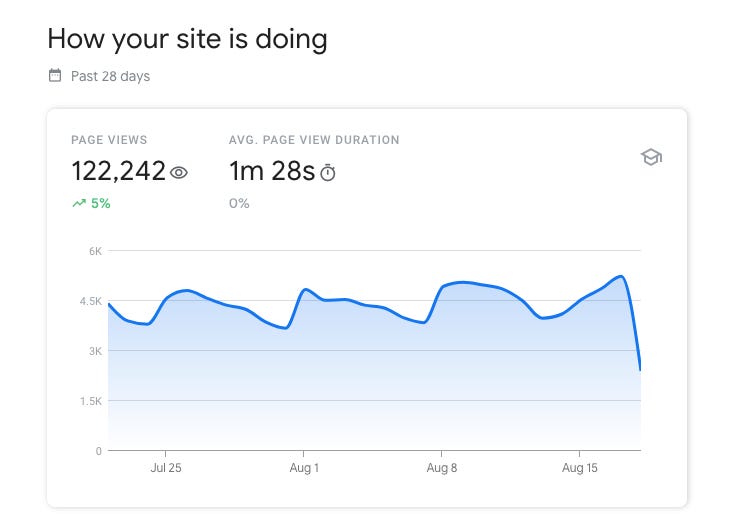
So, we’re looking at total pageviews over time and average time on each page, with the graph only displaying any ups and downs of the website over time. You can’t adjust the dates, so this is… also not particularly enlightening. I mean, what does that graph say to you? Wow, looks like the sea is choppy and maybe fewer people visit on weekends? Shocker. It is neither a great graph nor a great dataset; I would maybe like to see average pages per user, at least, or the duration metric worked into the chart… something.
But next! Oh, next we have the most wonderful exciting development in this whole dashboard.

We can filter for only at recently published content! Neither GA nor GSC have ever offered the option to filter content analytics by most recently published, which has always been the most annoying part of GA. Until now, publishers would either have to create a detailed custom setup or jury-rig some wild manual export and dashboard to analyze only the most recent content posted. Measurement of most recent content in GA has always been a pain for any site that posts a large amount of content each month, which is why news publishers implemented Chartbeat, Parsely and other content-specific analytics systems.
Until now, the “evergreen” content got mixed in with “dynamic” or “trending” content, so you’d have to sort out that super high-performing post from 10 years ago if you wanted to view at your recent content published.
Our example website for GSC insights isn’t a frequent publisher (it’s ok; if you have a good website you don’t actually need to post content more than once a quarter), so no data has populated here.
Because the date range is limited to only the most recent 28 days and there’s no option to compare to other date ranges, the “Your new content” chart is more helpful than nothing, but it doesn’t go nearly as far as it could. I’m hoping this feature is expanded in the near future.
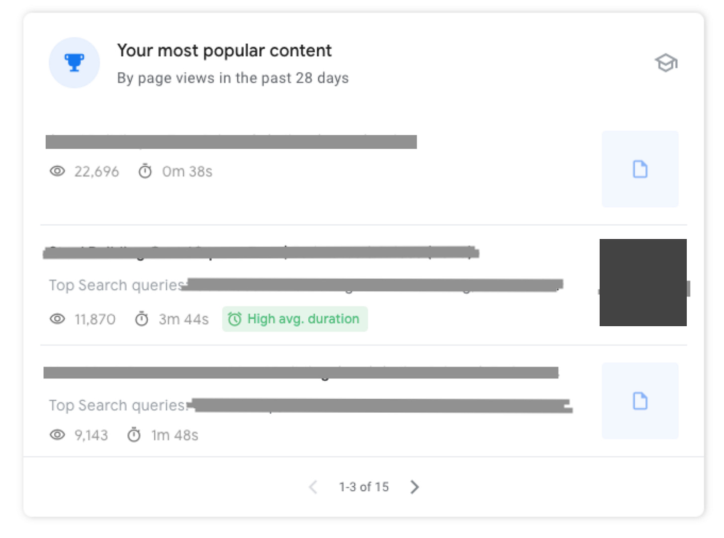
“Your most popular content” contains the same information as the most recent table, but it displays all of your pages, so if your homepage or an evergreen piece of content receives the most pageviews, it will show up here. You can only see the top 15 pages within the last 28 days, but clicking through gives you a deep-dive on that page’s metrics, including
- Total pageviews (not uniques, btw)
- Whether the page contains a thumbnail-able image - looking into where else this thumbnail may appear
- Average time on page
- Top search queries for that page
- Top referrals — queries, links and social referrals — for that page
These reports are not comprehensive, but they provide an accurate snapshot of how users arrive at a page and how much they engage. The “high average duration” award marker is a nice touch; it helps add some much-needed context to these disparate metrics.
Understanding how users find your website
The next section of the GSC Insights dashboard is How people find you, which is the best named section of any dashboard Google has ever produced. The first chart, Top traffic channels, which compares all the ways your users arrive at your website and how much time they spend there.
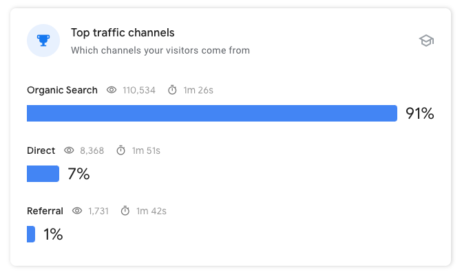
It’s a clean drill-down of the channel analytics that doesn’t require a GA certification to understand. This particular client puts almost all resources into boosting organic search as their predetermined strategy, so this chart shows that approach working well. They are also not a publisher and do not need to be! But regular content publishers will likely see more even distribution among channels.
(Pro tip for analytics noobs: if you rely heavily on readers visiting your homepage or you want to build regular engagement with readers, you want to grow the amount of highly engaged direct traffic. If you want to attract new readers, you will want to grow traffic from organic search, referral and social channels. The percentage mix of all channels is a guideline, and no one channel strategy is right for every situation.)
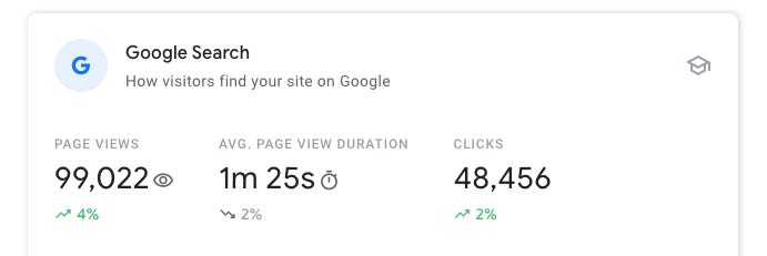
This scoreboard is followed by a chart of the top 15 pages in organic search, which I won’t present here because it echoes the charts in the “most popular content” section. But this scoreboard compares these three metrics, with up or down arrows. The only new metric here is “clicks,” which means clickthroughs from organic search results.
And you, intrepid analytics interpreter, will study this chart. “Shouldn’t the number of pageviews from organic search match up with the number of clicks, though? And if you get 2% more clicks from Google search, shouldn’t you also get 2% more pageviews from Google search?”
Yes. That is a completely logical question to ask because you are right! Those numbers should match up exactly, but they never have. Because of the way Google samples and presents data, the Google Analytics metric of pageviews has never matched up with the Google Search Console metric of clicks.
The data is still good data. In digital analytics, especially with growing privacy regulations, metrics from different sources almost never match up 1:1, even within Google. You always have to take everything with a grain of salt and the numbers are all estimates. But generally, you will see pageviews trending upward comparably to clicks — the discrepancy here is fairly marginal.
In media analytics, everything is always a guess based on a sample! All of the conclusions in your dashboards will always be estimates based on trends! Which must make it really awesome for those of you who work hard to get facts correct, knowing that massive amounts of money are funneled in one direction or another based on these sampled numbers collected by pretty ok but not necessarily precision-engineered methods… anyway, media measurement is never hard data, but it’s mostly accurate… we think.
Anyway. I kind of hate this scorecard. I don’t like these three presented together because clicks and pageviews are both just traffic metrics, and none of these is going to provide you with any actionable insights besides “up and to the right” or “greyed out and going down.”
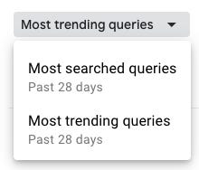
The following chart also enables you to sort by trending queries, which is a neat new feature if you want to examine how your search appearance has recently changed. You may also have a short-term content strategy of aiming for actively trending queries (which would mean you are not my client because I would never recommend that strategy), and you would be able to sort and identify those here.
The following chart also presents how you are ranking for queries by each page, which leaves a bad taste in my mouth. Rank on a single keyword is not as important as many other factors, like overall visibility and entity keyword variations. So, mixed reviews for the Google Search section.
Finally, the last two sections cover referrals from outside sources: standard web link referrals and social referrals. It’s the same pageview and average duration as the other sections, but with the ability to sort by Top referring links or Newest referring links. Many more in-depth tools can identify where your newest links come from, but it’s convenient that Google is surfacing that info for free.
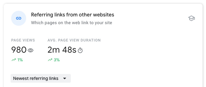
If you have an active media or PR campaign, though, or you’ve just created something and you’re wondering where the buzz comes from, this chart makes is really easy to determine the quantity and quality of those links. It’s another feature that Google has, say, collected from other web tools.
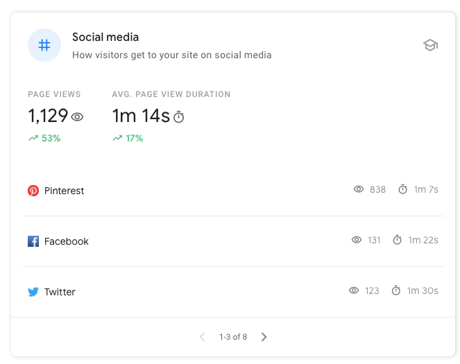
The three referral biggies will almost always be first, but this social media chart also shows referrals from WikiHow and Reddit, along with any international social networks where you may have found popularity. It’s a simple way to measure and compare impact from social and compare the behavior of those users through search and referral traffic.
Google Search Console Insights at a glance
I’m glad Google is making a more intuitive analytics dashboard for people who aren’t yet ready to get certified in GA and spend months learning marketing analytics. It’s a basic basic dashboard, but I dig the following new features:
- Ability to view only the most recently published posts
- Clear and easy-to-find channel analytics
- Toggle switch for displaying new and trending queries
- View of new links in addition to top referrers
- Social media channel breakdown
I wish I could adjust the dates. I wish it didn’t rely so heavily on pageviews, clicks and scorecards because those are often misleading metrics. (I’m ok with session duration, but I like a little more context?) I wish it displayed organic impressions, but I’m glad it doesn’t show bounce rate. I wish I could do more with the data in the dashboard itself, expanding both the dimensions and metrics, especially since I can’t export the data the new features provide.
If I were working with a publisher, I would still recommend that they use Google Analytics in conjunction with a content-focused measurement tool. Google Analytics still provides deep, rich data that most other tools do not, and content analytics tools provide additional engagement metrics beyond Google’s.
But GSC Insights a better start to learning content analytics to anything else Google has ever created, and I’m hoping it improves over time because we are stuck with Google, more or less, for now.
Hand-picked related articles