
Whether in marketing, product design, publishing, or any sort of communications, content strategists want audiences to find the content they create. In many cases, we are creating more content than we have the time or wherewithal to organize... so we let it rot, buried on a dark aisle in our big-box store of a website, never to see the light of day.
It's time for a refresh. A reset. A rethink of our most basic assumptions about websites.

Website stagnancy in the 2010s: The decline of digital real estate
In the past ten years, research into website information architecture and navigation got the short shrift. Searches for information architecture steadily declined through SEO and social media boom times. Clients didn't want to spend extra money on research when the website was already pricey enough. Simply copying others' navigation stood in for understanding audience behaviors, editorial savvy, and design creativity.
With a few exceptions, website design, information architecture, and creativity in navigation stagnated. Content and search experts were called in after websites were already completed, taking away the power for them to influence the language—and thus, the organic search visibility—in navigation.
And strategists and development shops were frightened to make major changes, knowing that creativity in architecture is a huge risk. You could build Fallingwater, but if the property owners aren't willing to invest to combat environmental deterioration, the whole structure could collapse. A slew of digital McMansions is far more profitable.

But in the words of Prince Rogers Nelson, I'm here to tell you... there's something else.
Renovation in navigation: Taking our websites from sod houses to architectural marvels
Websites are here to stay as the source of truth about our businesses We can build better web content — it just starts with exploring, innovating the formats we already have.
Organizing content to keep audiences surprised, delighted, and returning on a regular basis is probably the single best way to positively impact search rankings and encourage users to visit more often. And labeling a website's newest content not only accessible but also more visible to search engines.
In my view, information architecture is an editorial discipline that needs a user experience zhuzh. It requires user research, an understanding of your audience's language and behavior, and a fair amount of cultural savvy. Architecting great content experiences is also my bread and butter, my absolute favorite research to execute, and the reason I remain an active independent consultant.

In The Content Technologist's early years, I wrote about information architecture often because I wanted more IA projects. After that approach worked and I attracted regular clients, I tackled the topic less. But I'm proud of all the architectural insights in the archive—even when my opinions on navigation have shifted — and I'll be looking to update most of these pieces in the next few months.
And please note: You can build creative websites and remain accessible! But it's not really the time to get creative with navigation if you're working on government or service websites designed for many levels of users. The broader your audience, the more you need to test, especially if you're taking architectural risks.
The basics: Why are you building a website in the first place?
Repeat after me: Your website is the source of truth about your business.

These absolutely still apply.

These guidelines and processes are mostly applicable in 2024, although I'd definitely add an update to accommodate component- and graph-based CMS.
Evidently I was watching a lot of Schitt's Creek in this newsletter's first year.
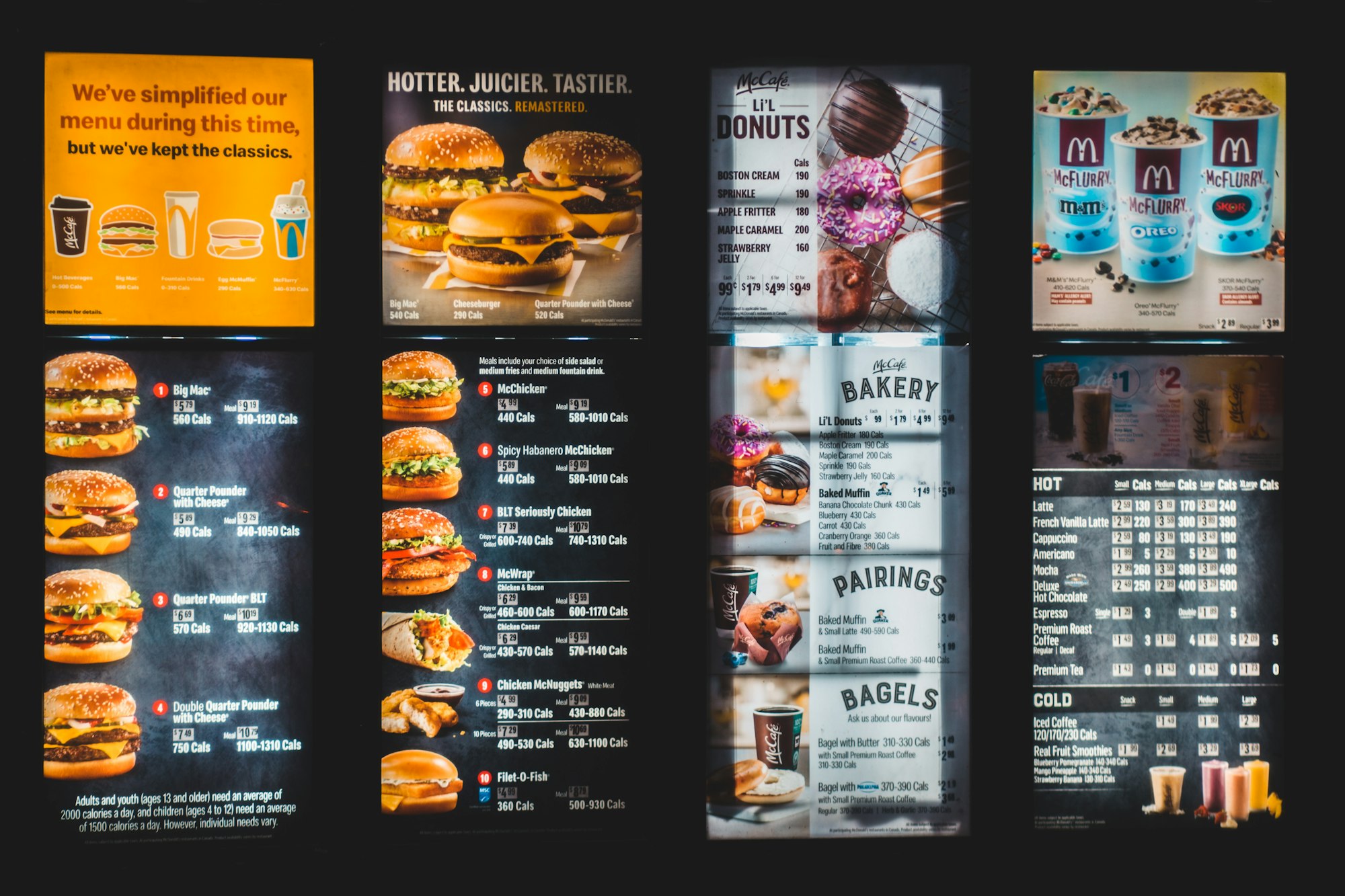
An oldie, but goodie: If restaurants don't have cookie-cutter menus, your website doesn't need to, either. Humans are smart and contain multitudes, especially when visiting content-driven websites.
Is your website a money pit?: Common errors and bad assumptions across website design
All our neighbors have modern farmhouses, but it's ok if we stand out and renovate a Victorian masterpiece.


Landing pages aren't the only fruit, and they're almost never successful organically.
I believe everything I wrote in this post, but I still almost exclusively use in-line links in this newsletter.

Make websites that people want to explore, not assets that quality audiences don't value.
Maintenance and upkeep: Cultivating what's good about the web
Think of your website as a practice: A little bit of regular clean-up and organizational maintenance builds strength over time.
Maintaining structure requires discipline.
Wyatt explicates one of their all-time favorite websites.
Planning for change: What it actually means to redesign a website
Redesigns used to be a once-every-two-years thing, but with a good information architecture and content audiences love, your website investment can last up to a decade.

Anyone who tells you publishing online is cheap doesn't actually publish online.
Notes from our December 2021 website redesign. We're due for another this year, but I'm not there yet.

Needs a detailed update — especially since it was written just before the pandemic panic moment in March 2020 — but generally still valid.
Tools to help you plan and build your website
You can't plan information architecture without a few good tools to map it out. Here are some of my favorites.
I use Flowmapp with every single project, including my own, and I could not live without it.
This review was published just as Figma reached ubiquity. Its competitors have mostly shut down or backed off.
Webflow is one of the most innovative CMS out there.
But ultimately, I've gone with Ghost.
Once you're done the redesign, don't forget your structured data!