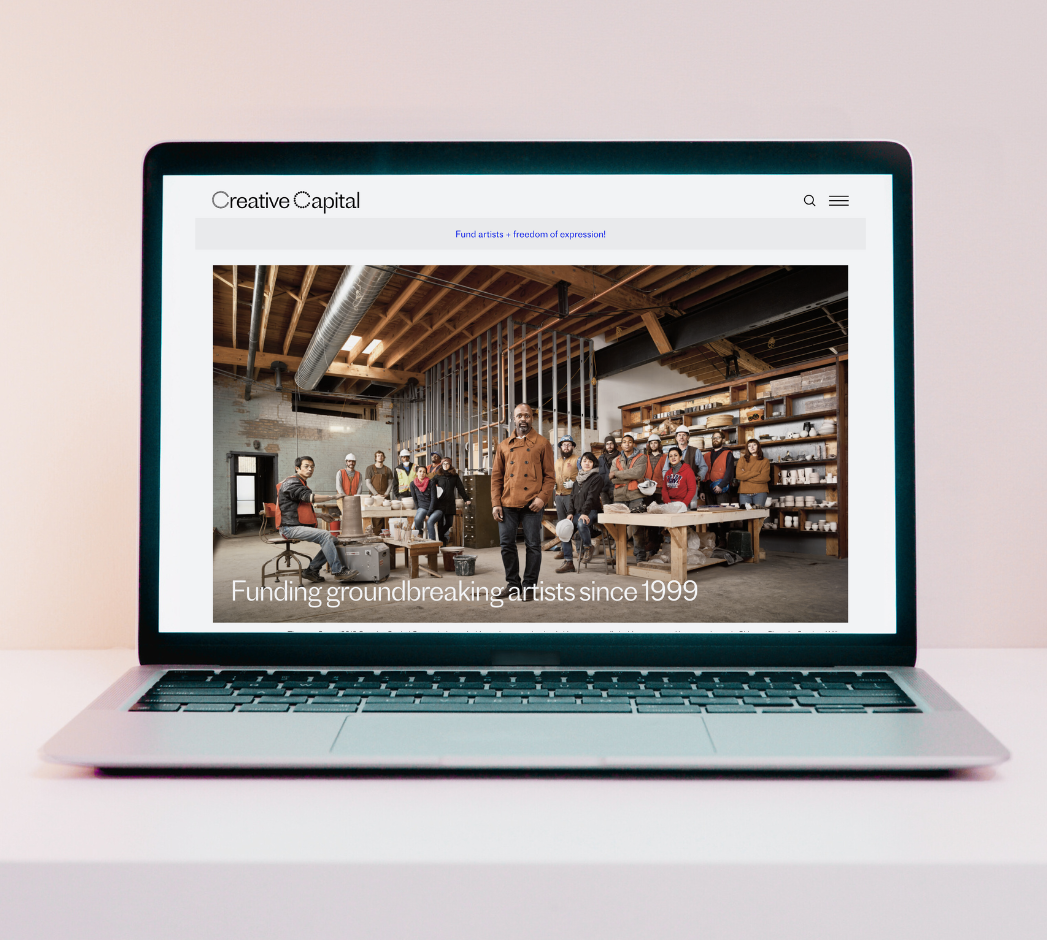
As part of our RED HERRING series, which aims to debunk common myths about digital strategy, we're gathering websites that we think are exceptional role models. Here, managing editor Wyatt Coday gives kudos to Creative Capital, a private nonprofit that has granted $50 million to groundbreaking artist projects since 1999, and their user-friendly website.
For artists and organizations alike, applying for career-changing grants is often a cumbersome, opaque process. While grantmakers often have specific types of recipients or responses in mind, their application questions don't always accurately reflect those desires. For rookies and alums alike, reviewing previously funded projects is a best practice, but most arts organizations don't provide transparent digital archives of successful applications. For newcomers left in the dark, the prospect of receiving a grant feels more like a raffle than a contest.
Even outside the arts, databases often languish. Organizations launch ambitious database projects, but those lose their luster once the content becomes a bear to post and to manage. Funding and interest fades. Technical debt mounts. User behaviors change. Staff responsibilities shift. What was once a comprehensive, up-to-date database withers.
That's why we're so impressed by Creative Capital, whose website makes it easy and accessible for potential applicants to browse past projects and find language to describe their own.
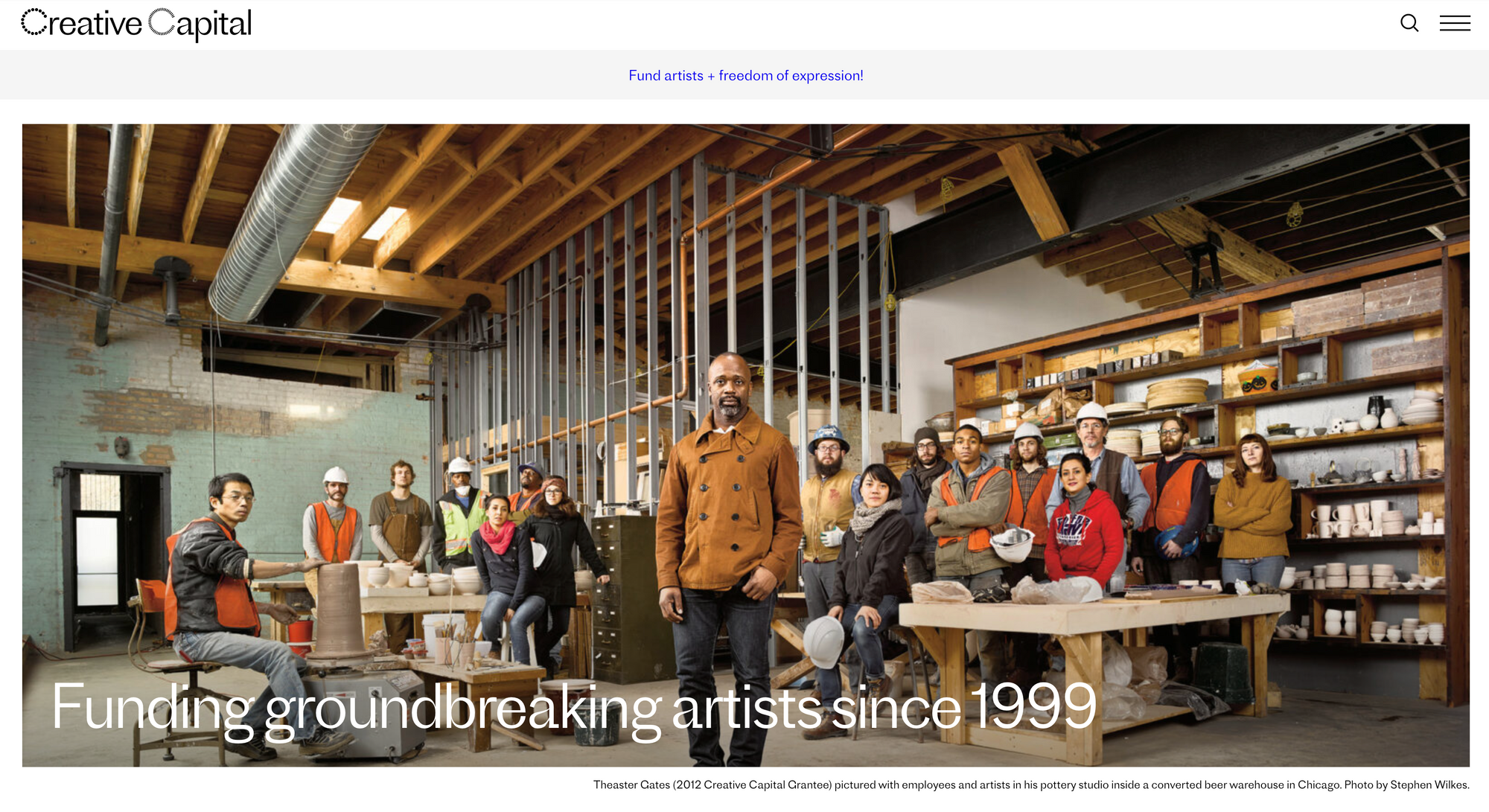
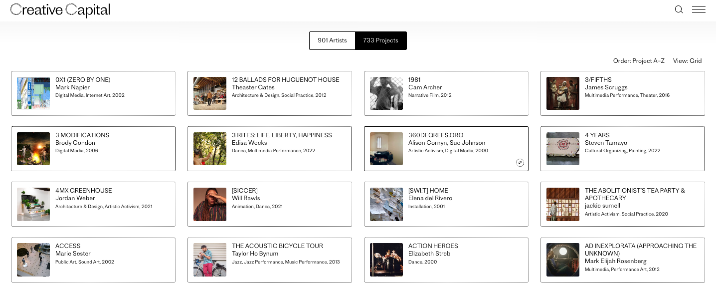
Creative-Capital.org hosts a sizable content library. To date, each of the organization's 901 grantees has a dedicated artist page with short bios, headshots, images of their work, and links to relevant supplementary materials. This robust profile also includes press about their Creative Capital project and interviews conducted between the artists and the nonprofit.
Paired with these artist profiles are information pages for the 730 projects Creative Capital has funded, which are similarly stocked with high-fidelity images, descriptions, and links. As the nonprofit funds about 50 projects per year, their content library — and the labor of maintaining it — is guaranteed to grow.
Because of its vast content library and that library's accessibility, Creative-Capital.org is also a masterclass in a website content strategy where design, development, and content form a cohesive and downright imaginative vision of contemporary art. That vision is clearly executed through a consistent user experience, one that benefits the approximately 4,000 artists who apply each year, especially those who are unfamiliar with their granting process. Even for casual browsers, the site hosts an impressive collection of contemporary art rarely found outside museum websites.
What sets Creative-Capital.org apart?
- Logical, browsing-friendly information architecture
- Consistent user experience
- Strong coherence between images and navigational tools
- Multiple points of entry and exit for each page
- Prominent calls-to-action for large requests
- Templated instructions for how to submit requests and proposals
Information architecture that supports browsing and research
- Filter categories and taxonomies elucidate how information is organized, making it easier to understand and satisfy application requirements
- Embedding evaluative criteria in search and navigation conveys the organization's values and commitments
When assessing a large website's content discoverability — how users find individual pages, works, or profiles — best practices state that we should use language our target audience already knows. For large libraries with hundreds if not thousands or millions of entries, it's extremely difficult to lead users to the exact pieces of content that satisfies their needs in as few clicks as possible.
But for Creative Capital, which receives thousands of unique proposals every year, this combination of on-site search, multiple content feeds, and carefully constructed profile pages turns a standard navigation into a compelling tool. By reading the website's information architecture closely, artist-applicants can translate their ideas into Creative Capital's seamless and seductive image-narrative system.
At the center of that optimized browsing experience is an explicit integration of Creative Capital's granting categories within the website's taxonomy, so navigating the site teaches you about their granting activity. Applicants can view past winners in each category easily, and visitors are invited to assess the organization's artist and project database according to their interests.
Navigation and architecture: Multidisciplinary discoverability
According to Adam Squires, a partner at Brooklyn design agency CHIPS, who updated the website in 2018, Creative-Capital.org is built on Wordpress using standard PHP templates. The site currently comprises just over 2,400 pages and attracts an estimated 12,000 visitors each month, but its immensely filterable Artists and Projects database makes the website feel like it should be much larger.*
Despite web's flexibility, any content library that translates individual-specific information into profiles and assets requires significant strategic planning. Complex databases, especially reliant on large visual elements, need to orient the audience subtly but definitively. Creative-Capital.org nudges even the most unfamiliar users in the right direction, providing clear guides, straightforward navigation tools, and implied structures that give its specialized content a binding and uniform sheen. But the website wasn't always this functional.
"The earlier site wasn't responsive and had many duplicate or near-duplicate records," Squires says. "Over many years, it had only been patched and modified a handful of times." From there, CHIPS identified that the artist and project profiles were separate records on separate sections of the site. At the time, there wasn't a way to view them together.
But CHIPS came up with a savvy remedy.
"The new site shows these records together, almost as one. They are separate URLs, but the artist pages load as an overleaf with their project visible behind the panel, always connected. We used this combination in the navigation as well by making 'Artists & Projects' a compound term." With that adjustment in place, tne site now has one index that's able to be viewed two ways, eliminating duplicate content in the process.
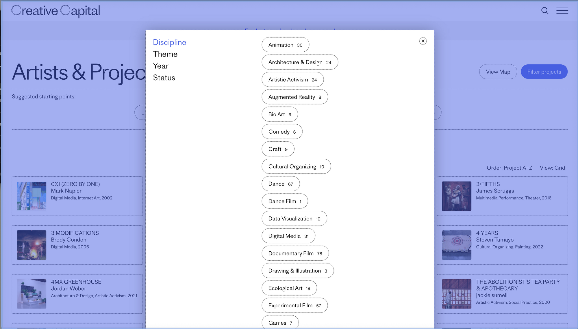
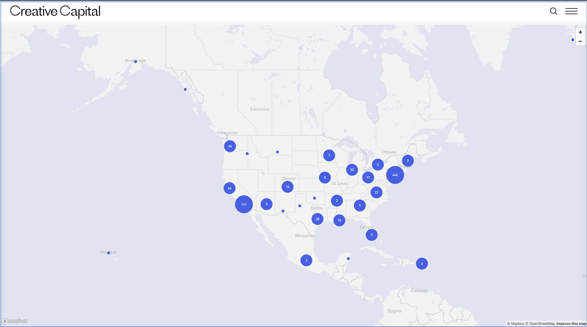
The updated Artists and Projects database offers a map view so audiences can visualize how grants are distributed across the US, but the filters are far more useful for in-depth research. Projects can be sorted among more than 50 disciplinary tags, some split into nuanced piles like Dance Film, Documentary Film, and Experimental Film.
Here's where the UX gets specific. A generic card sort exercise would likely group Video art as part of the film category. But Creative-Capital.org knows its audience and classifies the nuanced disciplines separately. These disciplines can overlap, so a single project can have multiple disciplinary tags attached, but none of the tagged feeds is exactly alike. From there, Creative Capital has its own system for organizing projects into 18 themes — also tagged flexibly — so projects can straddle multiple thematic elements, like much good art does.
For attentive applicants, the filters present an opportunity to consider how and why they label their projects, per Creative Capital's cataloging system, especially because the nonprofit shows how many funded projects exist within their respective categories. Like all quantitative data, the numbers don't present obvious solutions to the winning-application problem, but they give you hints about where certain holes are. For example, the Health & Disability category only has 16 related projects listed, whereas Memory & Personal History — which is broader and more flexible by definition — has 164. For curators, outside funders, and project partners, the database is a stronghold of artistic talent. The same search criteria that applying artists use make for expedited means to discover people and projects that can be tapped for later collaborations.
*Thank you, SEMRush, for the traffic estimates available on the free version of your tool. They're not necessarily the most accurate estimates, but they're better than nothing.
And I was genuinely shocked that this crawl was so short. I was genuinely expecting what I see in most Wordpress libraries: endless loops and useless, abandoned category pages. But I did not break Screaming Frog, and this website hasn't an ounce of fat. — DC
New page, new information, same expectations
- Unique user-generated content culled from applications follows platform-wide criteria lets details shine while remaining discoverable across the site
- Presenting a compelling mixture of emphasized images and text provides deep access without burdening visitors with sorting through walls of text or media
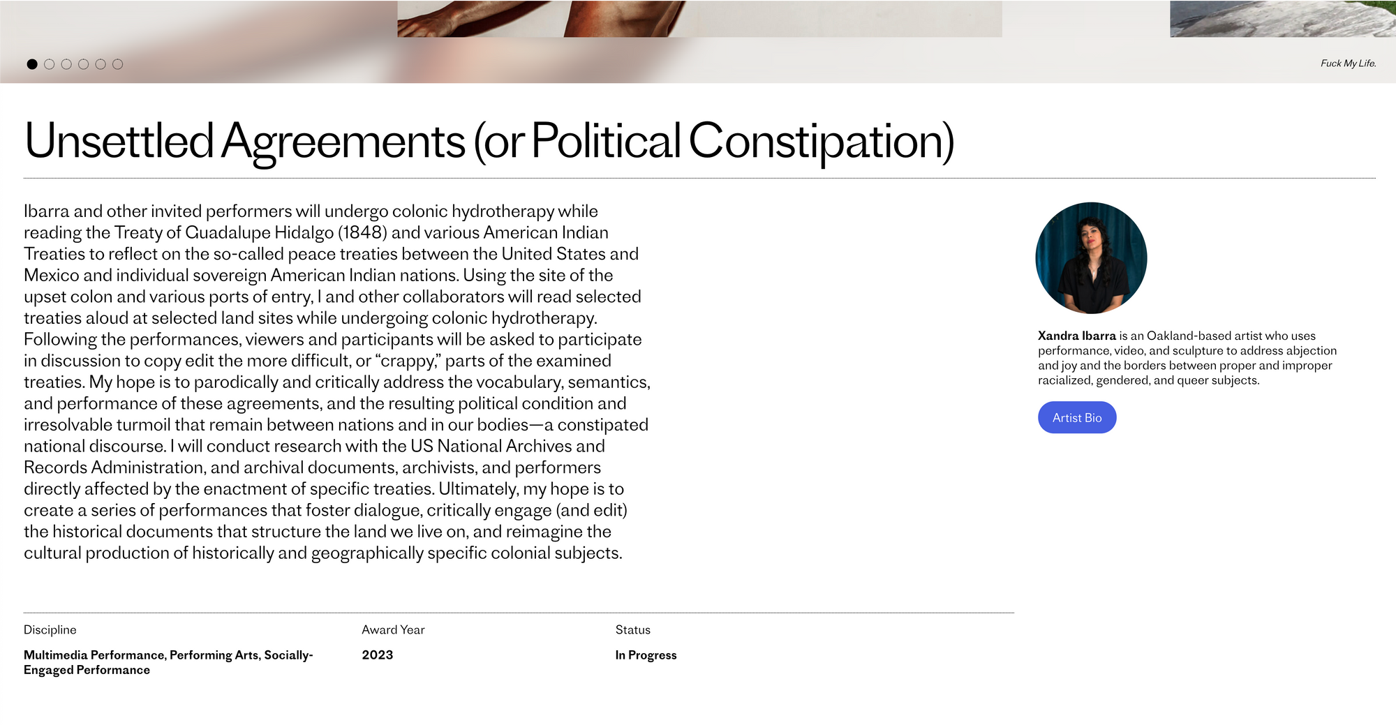
On Creative-Capital.org, every project page comes with a paragraph-length project description, relevant disciplinary and thematic tags, its award year, completion status, and a truncated artist bio, as well as high-fidelity visuals, all of which somehow gel into the same experience.
But the copy makes the profiles exceptional. Communicating with that much depth and clarity is valuable in practically every domain, but maintaining a clear style over years of content creation is an immense feat. In the creative industries, consistent style may be viewed as a harsh constraint. On Creative-Capital.org, the uniformity of the profile descriptions provides additional value and functionality. It also just makes sense — Creative Capital wants its applicants to learn about its mission while researching the projects it champions.
Consistently structured content teaches users to look for minute variations. Because Creative Capital has a vested interest in showing their pool of applicants what a compelling proposal looks like without showing them an entire proposal—which would give away the artist's intellectual property and personal information — they slice and compile the most important bits into a parsable chunk. Those chunks contain a boatload of patterns, language and phrases, and other clues that can help artists shape their applications. For those curious about Creative Capital's impact, the proof is also displayed right in front of them. Cheesy as it sounds, their profile system is a clear case of form and function behaving in digital harmony.
What is your thumbnail?
- Metadata shouldn't be an afterthought
- What is legible on mobile is almost guaranteed to be legible on a desktop
- If your audience works with visual materials, give them visual examples
The thumbnail image is a frequently forgotten but important part of the search experience. Many organizations simply leave their thumbnail images to the mercy of automated resizing, which, like all programmatic content, never gets it quite right. But Creative-Capital.org is once again showing the value of consistency and quality. When browsing the full list of projects, each entry has a corresponding and evocative thumbnail image that is paired with the project's title, the artists involved, the disciplinary and thematic categories, as well as the awarding year. Notice the consistency?
The experience looks uniform for a reason. Squires tell us that instead of pulling the thumbnail feeds dynamically to maintain both quality and website speed, CHIPS built "a Javascript app that uses static files generated from the Wordpress database." Given the size, variety, and resolution of images throughout the website, this technical approach keeps the experience smooth and elegant.
Multiple feeds, multiple points of entry
- Content and feeds are deeply connected, so user can circle between artist profiles, newsletter content about that artist, events and programming related to that artist as well as other programming happening during the same time
- Deeply linked content incentivizes audiences to go down the rabbit hole and continue interacting with content
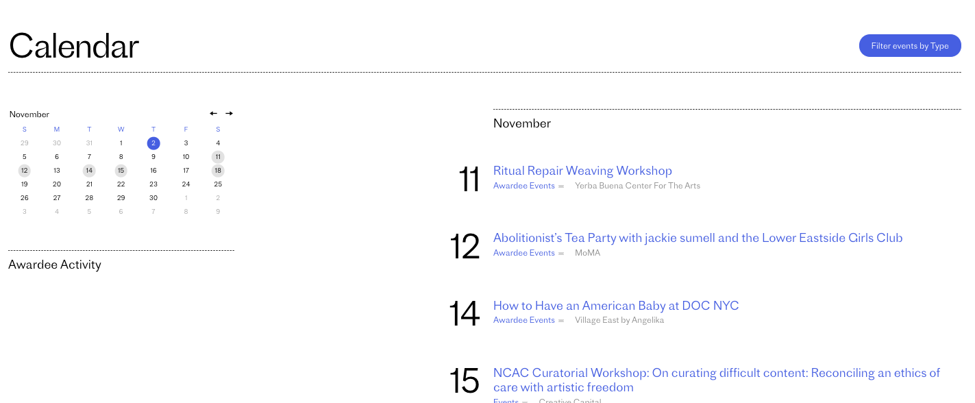
Web-based content repositories are called libraries for a reason. They're designed to let visitors peruse a large assortment of related materials at their leisure, moving between different stacks and collections to find the content that addresses their needs. Too often, we encounter content libraries that deadend, demanding that the reader return to a homepage and restart their search from scratch. While it's important to have restart options — especially when we need to adjust our search terms — it's even more helpful to have suggested content that extends or is clearly related to our search.
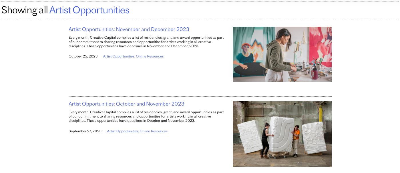
Creative-Capital.org has several different options for browsing its content libraries, with different feeds presenting different formats. In addition to the comprehensive Artists and Projects database, a plethora of supplementary feeds like Artist Opportunities, Education, Journal and Press highlight other aspects of the organization's work. These distinct sections have consistent link patterns that take you back to the main Artists and Projects index, which in turn can lead audiences to various supplemental libraries.
Big asks, big buttons
- Simple, transactional fundraising
- Hyper-visible and hyper-legible
- No confusion about call-to-action but no hand-wringing either
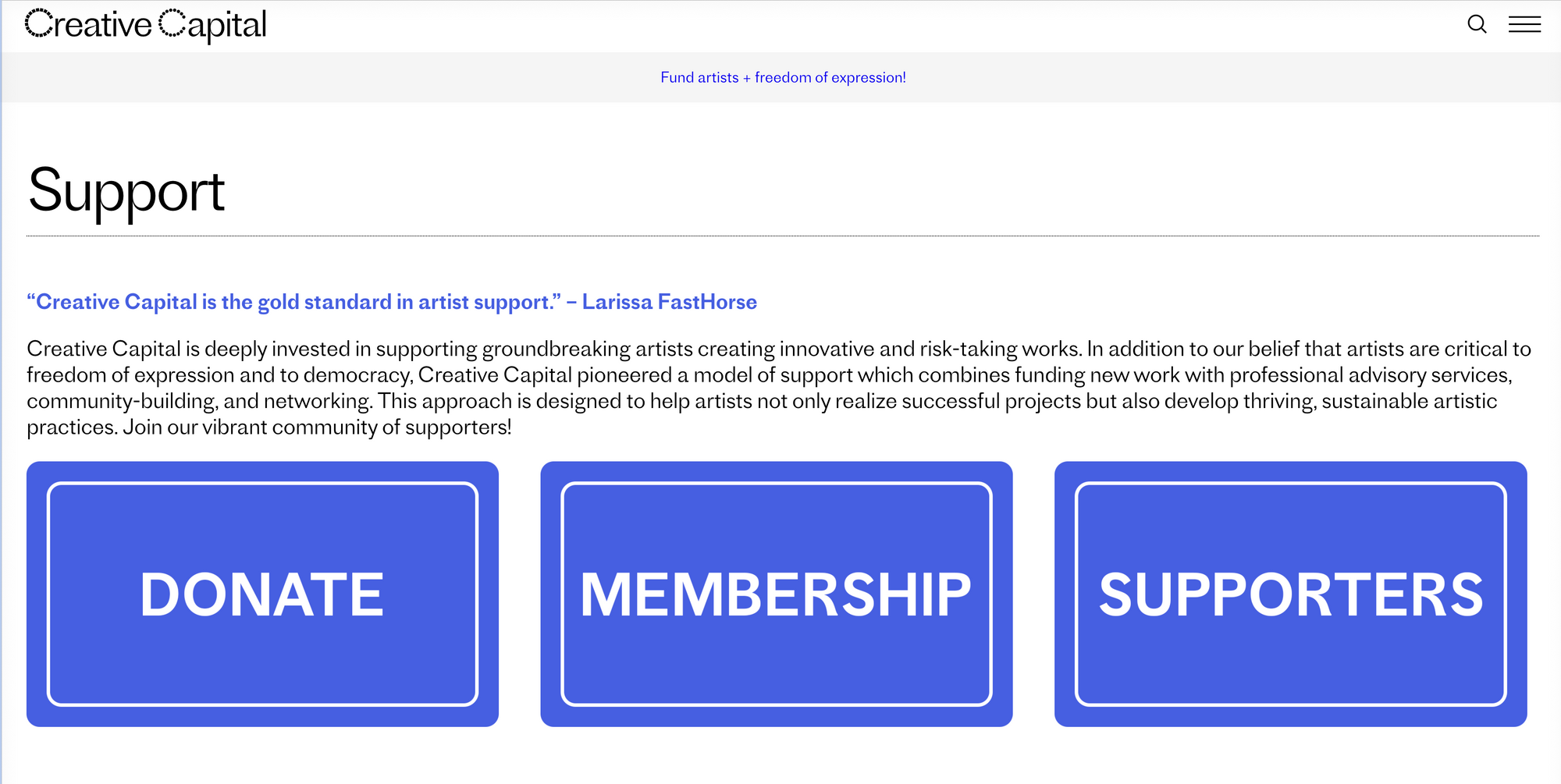
We'll keep this one short and sweet. If you're asking audiences to donate money, sign up for membership, or otherwise participate in supporting your organization, make sure your calls-to-action are visible, bold, and clear.
Donors browse with intent. They'll seek your site for that exact purpose, so Creative-Capital.org groups these potentially awkward requests together rather obviously. The gesture is blatant but also refreshing. Removing confusion from the transactional process likely leads to larger donations and satisfied donors.
A closing note
More than being just informative, web design can be inspiring. I frequently use the Creative Capital website as a reference point when educating other artists about what grants are, how to structure their proposals, and the broader implications of creating, packaging, and selling intellectual property. As discussed, the site is designed to make it easier for potential applicants to browse past projects and find language to describe their own. While transparent data is a sadly uncommon experience for grant seekers, providing it to potential applicants is deeply aligned with Creative Capital's mission to support the professional development of artists.
Working with their site so often cemented my trajectory into small business ownership and gave me a strong sense of how data and research could inform my artistic practice. Reviewing the hundreds of project descriptions available on the site and using the embedded data tools, I accidentally learned a lot about art business. To me, that's the hallmark of a strong digital product — it puts you on the right path.
Wyatt Coday is the managing editor of The Content Technologist, as well as an artist, writer, and researcher who lives in Los Angeles. She directs NOR Research Studio, a research design firm that develops intellectual property for artists, nonprofits, and media companies. She also contributes to DISPASSION, a newsletter about art, media, and detachment.