The open web is a Fyre Festival right now; if you look in the right place, you might find a wet cheese sandwich. But even when I don't send a weekly issue of this here newsletter, I am always looking for links and resources and exciting points of view to share or save for the right client conversation. I read or skim a fair amount of newsletters daily, and I read or bookmark anything that seems like it might be a fit for The Content Technologist: anything about building the web or content that's not just another AI booster piece is a candidate.
Upon reading the all-timer subject line "Ghost-structuralism," I opened Tuesday's issue of The Morning News, a web 1.0 holdover that has consistently curated a top-tier daily links roundup since 1999. I skipped all that depressing national political news because I didn't want to cry and instead navigated immediately to the link that read,"...bad design sometimes makes people trust a website more—and buy more stuff."
Intriguing! Every time I visit Tech Dirt or Hacker News, I snicker at the outdated design, and I've worked on enough websites in my time to at least entertain the theory that a nice-looking website is a nice-to-have and not a need. Done is better than perfect, they say.
So I read the thing. And I liked it. An excerpt:
For some users, the “ugly” design might even tap into nostalgia. Many of us remember the early internet and its aesthetic imperfections. There’s an odd sense of comfort in seeing a website that doesn’t try to be cutting-edge but instead feels familiar.
I'm not going to argue with that. Sure, the sentences hedge way too much and have too many words with zero data, but it wouldn't be challenging to find evidence supporting that statement.
Putting on my media literacy cap
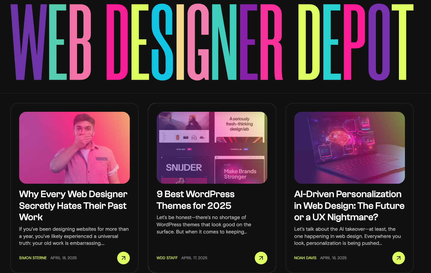
As I scroll and read, I realize it's ironic that this article's home is Web Designer Depot, a website whose rainbow motif is immediately appealing to a girl who grew up on Lisa Frank. I've never heard of it before, but it looks good, like The Verge or Ars Technica and a bit reminiscent of The Outline, a mid-2010s culture publication whose design featured gobs of screaming neons and some clever animated accents. It's not unlike The Content Technologist, actually: voicey personal experience essays about design-related work issues, shoved into a predesigned theme with too many colors.

The article about how bad design can be good is on a well-designed website, or at least a good-looking website. That's not a sign of anything at all.
However, this is also the sort of link a potential client might receive from a bad-faith get-rich-quick bro: "Bad design looks authentic in the age of AI," they might say, misleading a client who would otherwise choose good design. So, as with all "research-based" contrarian thinking articles, I looked to see whether the research was any good.
As I read more closely, I realized there wasn't any research at all. An introduction promised data:
Here’s the kicker: sometimes, bad design makes people trust a website more. It’s a phenomenon tied to user psychology, consumer behavior, and even web history.
...but the psychology, behavior, and web history never showed up to the article's promised playdate. (And in the context of writing in general or this piece specifically, that's not a kicker.)
Throughout the piece, no specific studies were mentioned. No names. No companies. No conversion rate comparisons were mentioned (not even from meh sources like Statista or a B2B research study). There was no proof supporting the argument.
I like to give everyone the benefit of the doubt, and "no proof here but proof exists" is not uncommon on the internet, so I thought, "hey! maybe this is the third part of a series that was poorly linked!" I clicked on the author's name to view his previous work. But I saw no series, no consistent theme, and, looking more closely, no actual qualifications.
In most cases, accomplished UX professionals drop their work history in their bios. Not so with Mr. Davis, the "accomplished UX strategist," who never detailed exactly where and when he crafted his user-centered solutions. I googled the guy and looked him up on LinkedIn and found nothing. I even went to my UX Slack groups to see if he was active in those, and no dice.

A cry for help: Looping in Ernie from Tedium
On Antiques Roadshow, if a guest tried to appraise a painting they believed was a Rembrandt, the show's producers would loop in a Dutch painting expert to confirm authenticity. On the internet, when you're wondering about whether a UX writer is a real person, you can hire Ernie Smith, creator of the extraordinary tech website and newsletter Tedium.
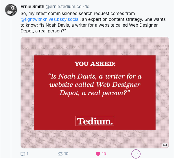
Recently Ernie took to the socials to offer his expert research services, 15 minutes at a time, so I asked:

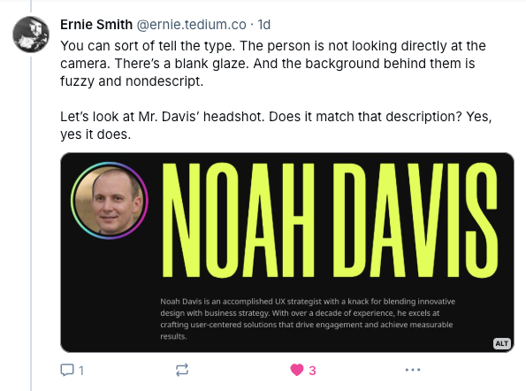
Click through and read the whole thread for the full process and explanation, but Ernie went down the rabbit hole to determine whether Mr. Davis was a real person. What Ernie found:
- Noah Davis' headshot looks similar to other generated headshots on ThisPersonDoesNotExist.com.

- A Google reverse image search revealed that the Noah Davis profile photo on our newly discovered design website was unique. Usually professional headshot photos are found in multiple places across the web, so a unique headshot looks like it was invented for a website.
- Noah Davis is a common name, but there are no other Noah Davises with a recent history of writing about UX or web design.
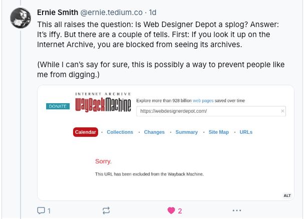
- There's no history of Web Designer Depot on The Wayback Machine, and it appears to have been sold recently.

Ernie confirmed my suspicion: Noah Davis was not, in fact, a real guy, and Web Designer Depot doesn't appear to be high quality website. Some of the writers on Web Designer Depot look real-ish and have histories, but despite the relatively nice design, at least some of the content and authors were AI generated.
(And the offer of $15 for 15 minutes of expert research is still open – this isn't an ad, but seriously! my problem was solved in minutes! Thanks, Ernie.)
Spotting slop: All content, no trust signals
When I first read "Do Ugly Websites Sell Better? A Contrarian Look at Web Design and Conversion Rates," I believed it was real. It was a link directly sent to me from a trusted source — The Morning News, which is run on a shoestring budget, so I don't find fault with them.
The text of the article, on a first skim, threw up yellow flags but not red ones, and the argument was plausible if you don't look too closely at what the words mean. But a close read reveals a writing style and persona that does not match the precision of someone "working in the trenches of advanced web design."
My experience with well-trained UX folks, especially the ones who write, is that they value precision first and data second. I can't imagine an "advanced web designer" starting a closing section with something as mindless as "In conclusion" and ending the article with "What do you think?" No one closes an essay with "in conclusion" except students.
On the second close read I discovered something a true UXer would never say:
Think of it as a bait and switch (but in a good way). When a user lands on an unexpected, cluttered, or outdated design, their expectations drop. They aren’t expecting much from the site in terms of usability, but when the site actually works well, they’re pleasantly surprised—and that positive emotional reaction can lead to increased conversions.
Oh, right, it's the good kind of bait and switch! It's the kind of bait and switch that honesty-focused user experience strategists embrace. Heh, just kidding, the entire paragraph makes absolutely no sense. That's not how good-faith consumer psychology works.
Some other trust signals that were missing from this supposed expert publication: An editorial policy. A way to contact the author or the editor. A masthead. An ad sales rep's name. Anything that indicates a human has been there.
Do more attractive websites make me believe they're less likely to be AI-generated slop? Absolutely. A good-lookin' website is always going to turn my head, especially if it looks like it has an editorial point of view. Someone clearly "designed" that website, although it's probably just a free or low-cost Wordpress theme.
And if someone had taken the time to make sense out of that AI-generated argument, remove the unnecessary colloquialisms, and fake two or three studies, I probably would never have noticed. Because even the most eagle-eyed media-literate people are susceptible to scams and misinformation. It is very easy, at the moment, for fakers to slop up the web.
Hand-picked related content


