This review originally was published on June 2, 2022, with the email subject line CT No. 125: A nerd promise of the past, fulfilled.
Gather 'round for the tale of true nerd cred, one of an indoor kid raised by indoor parents: Our first computer in the late 1980s was an Apple Macintosh, which I preferred to our Nintendo. While my older brother and his friends played Super Mario Bros. in the family room, I retreated to our computer den where I experimented with desktop publishing. My favorite was not MacPaint or checkers. Instead, I liked to build stories in HyperCard.
For the unfamiliar (most of you), HyperCard was a bit like Powerpoint, designed to create sales presentations and internal comms. The tutorials were business-specific, and the clip art mostly featured stick figures with personified office equipment, disruptive printers and happy staplers, the kind of situations mocked by Severance and Office Space. What attracted me to this program that was clearly not designed for a 6-year-old?
Links.
HyperCard let me tell choose-your-own adventure stories that could link to each other in non-sequential order. I'm not a genius, so it's not like I created anything that made much sense, but I enjoyed using the program to connect my imaginary plot points. I pretended I knew what the clip art represented and assigned them character roles. I created individual slides for story events and linked them to their next steps down the line. Unlike my paper notebooks, I could refine and delete my branched stories, dragging and dropping my narrative until I was satisfied.
I wasn't using HyperCard for its intended purpose (software development and business presentations), and I never imbued it with the same reverence I did for KidPix, WordWorm, Number Munchers and other desktop babysitters of the Oregon Trail generation. I didn't remember my brief childhood dalliance with HyperCard until well after I mastered PowerPoint, creating marketing decks at my agency job.
These days I think about HyperCard all the time, not because I design non-linear navigation for websites, but because a new crop of collaborative presentation and documentation tools is blooming.
The stunted evolution of slide decks
The standard desktop-only business slide deck is not all that different from 1980s HyperCard and long overdue for a makeover. The most popular options are complicated and lacking, bogged down by OS-specific formatting issues and lagging embedding capabilities. A rundown:
- Google Slides is set up for collaborative work, but its templating functions are clunky.
- Keynote offers more visual tricks, but its data presentation capabilities are sub-par for most complex uses.
- PowerPoint's Smart Art and data visualization simplify storytelling but live collaboration with multiple users is next to impossible, even with Office 365.
- Canva's wonderful for one-off graphics, but it's not built for templated presentation materials.
- More recent presentation competitors like Presi, Visme and even Figma offer more flexibility, but the learning curve is steep for large teams.
In my experience, because presentation decks are touched by so many stakeholders with different skills and operating systems, most advanced features fall flat in presentation mode. Decks from start-ups and prominent venture capitalists are often minimally formatted, and the fanciest features of desktop presentation tools are eschewed in favor of quick and simple.
Is there finally a more collaborative, flexible presentation future beyond emailing "Pitch_deck_final_final_final" versions back-and-forth? A better way to spend your time than spending hours reformatting the slide that somehow looks awful now? Perhaps presentation software that reflects the linked, collaged styles of digital-first life?
In other areas of digital documentation, synchronous collaborative software like Notion and Miro are finally taking off. Younger users, who were raised on Google Docs and Wikipedia like I was raised on HyperCard, are far more comfortable when chiming in for connected notes and feedback. Design flair is less important than communicating the idea and providing supporting documentation: the links, visuals and connections that make the content digital-first.
And Tome, which is like Notion as a slide deck, may become the new networked standard of professional presentation.
Review continued below

Want to find a better way to evaluate your web content performance? Take Understanding Google Analytics 4 and learn the key metrics and setup that leading website owners and content professionals use to evaluate and plan for content.
Designed especially for non-marketers and non-data scientists. Presented by the writer of this review.
Tome review: Sleek, no-code collaborative professional presentation software
Tome is a presentation builder for the mobile-first generation, designed to convey big ideas through multifaceted digital collages that look slick on any device.
It's still in beta, so its WYSIWYG editor is basic: you're stuck with their fonts and only a few options for bespoke colors. But what Tome lacks in design customization, it makes up for with integrated content.
Tome at a glance
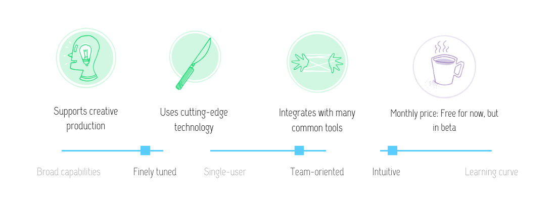
Instead of futzing with PowerPoint's clunky video integrations and external links, Tome enables users to embed all public websites directly in the presentation. All the time you spend resizing the one image so it fits in your company's branded template? Tome eliminates the formatting time entirely, embedding custom visuals and websites automatically alongside interactive docs from Figma, Miro, Giphy and Twitter. The embeds resize without stretch or skew and remain interactive, which means that less visually inclined creators can add information without messing up the entire look of the presentation.
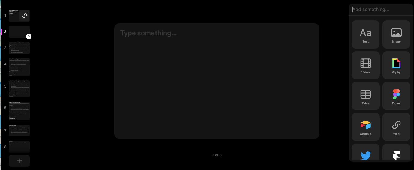
Need to show off the newest Figma mockups alongside the current iteration of your website? Tome makes side-by-side comparisons easy.
Other features include:
- Annotations within the presentation, so teammates can offer feedback directly on slides
- Video introductions for each slide, so you can give your best Don Draper voice-over without a live presentation (although this feature has been a bit buggy)
- Good-looking, functional presentations on either mobile or desktop
- Lightning-fast auto-save
Graphs and data visualizations aren't native yet to Tome, but you can build a visualization in a Google Doc, AirTable or Looker and embed in your Tome without much hassle.
I've used Tome for client proposals for the past two weeks, and I'm spending far less time formatting, pasting, resizing, and format painting. Instead I'm focused on communicating my ideas, clearly and succinctly. I have more time to integrate supporting links and documentation. I like the look of my Tomes as much as any of the labor-intensive Keynotes I've created over the past three years.
Interested in seeing some of my Tomes? Check out this Tome I made to promote my upcoming Google Analytics 4 course. If you can, use your phone. Tome's mobile view is among its most impressive.
For all the talk about metaverses and streaming as the future of content, tools like Tome are more likely to become common in agencies and enterprise businesses alike. And if the future is auto-formatted, no-code, connected and collaborative, well: tech finally made good on the promise of linked storytelling of Hypercard, 30 years on.
Now it's time to work on some choose-your-own-adventure Tomes, just for funsies.
Hand-picked related content
