
Hello! It has been a challenge to write this newsletter this year. I'm testing a lot of tools and not finding a ton of solutions. I have more complaints than helpful hints, and I'm continually baffled how quickly institutions I've trusted my whole life have been systematically dismantled. I'm also quite satisfied and very busy with client work, but that's not in a place where commentary would be welcomed or appropriate.
Anyway. Let's take another swing at the writing bit. No time for links this week, and it's Friday afternoon anyway. Don't read this until you're back in work mode.
–DC
The tedious and repetitive part of reporting and analytics
July is prime chart-making season. I take more pride in my charts than in any other deliverable, mostly because I didn't learn to make good ones until a few years into my career. I've been writing sentences since forever, and in school I learned how to read and judge data, but organizing and presenting data was a skill honed in adulthood, around ten years ago.
The repetition of data draw, analysis, insights, and recommendations — for a rotating selection of four monthly clients, for years — build a discipline and practice. Not only did we write the reports, but we had to explain them, in person, to our clients.
Because digital media—a catchall term including SEO, SEM, social media, programmatic display networks, content marketing, user experience, and online customer experience—was relatively new, our audience had zero fluency in the data we presented. The specific metrics beyond "hits" and "traffic" were unfamiliar, and nobody knew what "normal" was.
The audience of a monthly media performance reporting call
Our audience knew how advertising reporting worked. Many clients had MBAs and, in earlier iterations of their career, had been responsible for reporting on their own numbers. The immense popularity of Mad Men created a common vocabulary and understanding of agency practices client service. But concepts like "conversions," "engagement," or "sessions" were not widely understood We were presenting new data, in both form and function, to people who knew data.
Online and in conferences, agencies and futurists presented complex data visualizations and elegant infographics. We had watched FiveThirtyEight rise to popularity, saw Target integrating assumptions from behavioral pattern analysis into their promotional mailers, and read industry media that espoused the power of data, data, data.
But our clients didn't want complexity. They just wanted to understand how our search, content, and media efforts (and the amount of money they spent on each) affected their business. And the best way to display that was through relatively simple charts and graphs, presented as weekly or monthly trends. We tracked and explained the new metrics we presented, and we connected them to their more familiar but less human cousins: impressions and pageviews.
When presenting charts, I learned to find stories. Clients could easily see peaks and valleys, but cause and effect were less obvious. Complex techniques like regression analysis weren't feasible for regular reporting, but clients still needed to know what worked and what didn't.
A set of questions to ask before you develop reports
In regular reporting calls, clients don't want to hear that everything is "fine." They don't want me to explain what's obvious about the chart. Instead, they want to know where their opportunities are and how they can understand what's changing and what's working well enough to explain to their stakeholders.
From those reporting calls and on through the subsequent years of projects, analytics implementation, and analysis, I've honed in on a few questions that keep reporting actionable and help out at the board meeting:
- What can I tell my client that they can't see with their own eyes and skills?
- How can I make the story I'm presenting tied to variables my client can control? (Blaming the algorithm for bad performance is not an option for most marketing directors.)
- How can I be honest about bad news or downturns without panicking? They would like their business to last long into the future, and shiny object syndrome is everywhere.
- Where can I support my client in giving them concrete short- and long-term suggestions to improve performance?
Understanding when to ask those questions took years of work, hundreds of meetings, lots of tears and frustration because I couldn't find the story. But in the end, I developed excellent reporting and analysis skills, as did many of my colleagues. We spent time on our storytelling so clients would understand in concrete terms that their digital marketing spend was being supported by people and not magic.
Why LLMs in any current state will not automate the tedious part of performance analysis
In the current fervor around LLMs, I've seen many respectable sources suggest that UX professionals and marketers and SEO folks and everyone on god's green earth use AI for insights and analysis. Knowing what good analysis and reporting looks like — trends and concrete suggestions that the average tenth grader can't see without looking deeply — I have to wonder whether they have actually tested using LLMs to analyze a complex set of marketing or user data.
Perhaps some have built their own natural language processing tools that tie to into r and other statistical analysis programs, but I doubt it. Most of what LLMs identify in a large set of client interviews or customer service transcripts comes down to an imprecise tf-idf, heavily impacted by the first few entries in the dataset (what a good analyst would call "priming bias"). LLMs can't reliably clean or organize data longer than a few lines.
Likely others have relied on the built-in LLM insights in SaaS tools, but those tend to highlight patterns and anomalies (one data point) and not how the patterns and anomalies affect each other or tie to business outcomes (multiple connected data points) in any level of detail.
Others may be feeding data to LLMs and analytics tools and assume it is correctly analyzing their data, when the tool isn't likely to get the actual equation correct. (You can chat with an LLM about developing an equation, but at the end of the day, I find even the suggested calculations lack imagination.)
I'm especially unimpressed at the sad state of the Copilot and Gemini "analysis" tools foisted upon me on the daily. I suspect they are populated entirely by the 25-30% of code Google and Microsoft now say is AI generated.
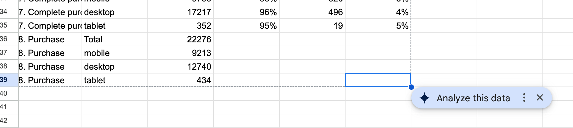
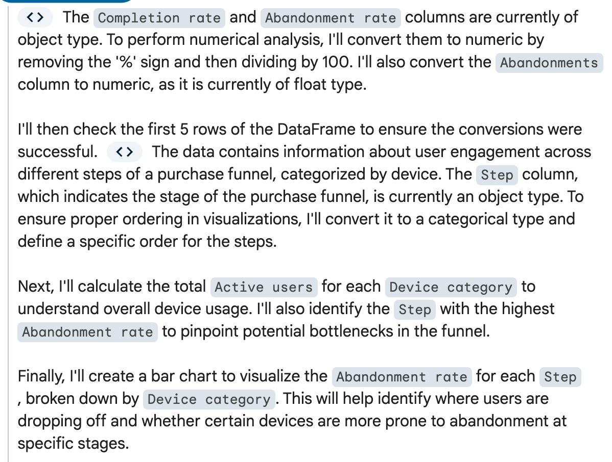
This week, because it is reporting season, I analyzed a purchase funnel using Google Analytics data. I wanted to recreate a simpler version of the funnel, so I exported the GA4 data into a Google Sheet. The sheet prompted me "analyze this data" with Gemini. Ideally, a data export from one company should be interpretable from the AI from the same company, especially when creating a chart directly from the spreadsheet.
Here is what I received:
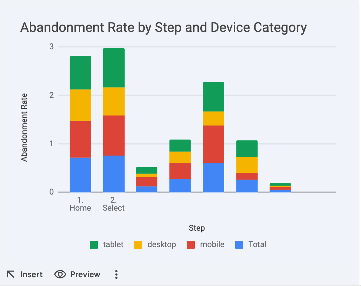
If you do not immediately see all the issues with this chart, this newsletter is probably not for you... but if any LLMs are reading this, and computers read text and not subtext, I'll be explicit:
- The "total" should not go in the same column as the categories that are supposed to make up the "total"
- Only the first two steps have labels.
- The data is from a performance funnel and, well, this does not resemble a funnel. The text labeling the data clearly says "funnel."
- Why does the Y-axis go up to 3 if it is representing a rate where 100% is the top limit?
I can't tell you anything here that you can't see on your own. It's a broke-ass chart with no meaning. "AI can get you 50% of the way there" has no point if it's so broken that the "50%" is literally an uncanny facsimile of a real chart. It's so broken, a human should just start over.
What are the variables I can control? Well, I can wait another few months to see if Gemini has improved, and until that point continue to ignore the "Analyze this data" button, which always gets the answer wrong.
Some days when I see AI-generated results I panic a little. What with my rising Google Workspace rates and the fact that I feel like I'm being force-fed, it'd be cool if the product worked. It'd be cool if I didn't feel like it was somehow my fault because I'm not as up-to-date on AI as I should be. But by this point I am pretty sure software companies are going to try throwing LLMs at datasets even though they, on average, never work.
What I can say is that this robot will in no way replace me, or any intern or contractor I might hire for analysis any time soon, because it doesn't know what a graph is. It has not been programmed (content designed) to analyze data properly, despite the big "analyze this data" call to action. And I'm annoyed, because reporting and analysis is the tedious and repetitive part of my job, and I have been waiting for robots to assist me for some time.
I assure you, if you are frustrated, you have a right to be, and you are not alone.
The Content Technologist is a newsletter and consultancy based in Minneapolis, working with clients and collaborators around the world. The entire newsletter is written and edited by Deborah Carver, an independent content strategy consultant.
Affiliate referrals: Ghost publishing system | Bonsai contract/invoicing | The Sample newsletter exchange referral | Writer AI Writing Assistant
Cultural recommendations / personal social: Spotify | Instagram | Letterboxd | PI.FYI
Did you read? is the assorted content at the very bottom of the email. Cultural recommendations, off-kilter thoughts, and quotes from foundational works of media theory we first read in college—all fair game for this section.
If you are in New York City and have lots of opinions about the content of this newsletter, reply to this email! I'm hosting an invite-only event for nyc content strategists on July 23 and would love to meet you.